Cyber Risk: A Devious Data Dilemma

Aaron N. Hillebrandt | January 14, 2019

As an actuary, I'm constantly searching for consistent, reliable data. I sometimes catch myself daydreaming that cyber-risk data is like workers compensation data—that I can easily find a benchmark loss cost or loss development pattern for a given market segment in most any scenario. But then I snap back to reality and find myself standing in the middle of a cyber-risk data minefield.
Several organizations aggregate, analyze, and publish cyber-risk-related data studies, such as studies on data breaches. It's tempting to pull some data from one of these studies, then we're off the races, right?
But cyber-risk data is not so easy. Since cyber-risk data reliability is in its infancy, we must analyze a given study itself before we use its data. Why was the study conducted? What was its data source? What type of data is it? How much massaging, filtering, and adjusting was done?
Different Data
Take, for example, the below graphs of average data breach costs from two cyber-risk study authors: the NetDiligence 2017 & 2018 Cyber Claims Studies (NetDiligence) and the Ponemon Institute 2017 & 2018 Cost of a Data Breach Studies (Ponemon) sponsored by IBM Security. Note that the Ponemon data shown below is specific to the United States while the NetDiligence data is from multiple countries; however, at least 94 percent of the NetDiligence cases are from US organizations.
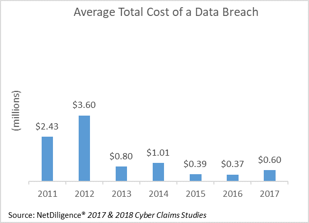
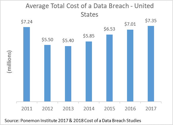
The NetDiligence graph, above left, indicates average costs per data breach in recent years of less than $1 million. The analogous graph, above right, from Ponemon, shows average costs per data breach for the same time period of around $7 million. This difference is a multiple of at least seven—in other words, one metric is at least 700 percent of the other. How can there be such a large difference? Now, let's instead consider the average data breach cost per record breached.
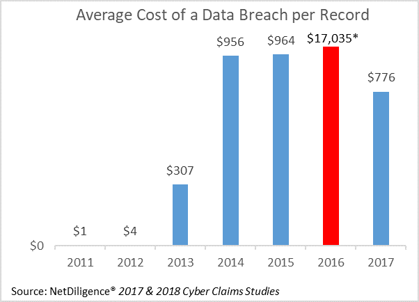
Extreme value truncated for purposes of graph.
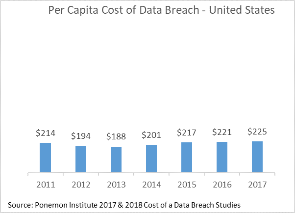
The NetDiligence graph, presented above left, shows extreme volatility in the average costs per record, varying from about $1 per record in 2011 to about $17,000 per record in 2016. The analogous graph from Ponemon, above right, indicates average costs per record in recent years have been relatively stable, between $200 and $225. How can the average cost per record be simultaneously extremely volatile and relatively stable?
Understand What the Data Represents
As it turns out, the NetDiligence study uses insurance claim data, which includes some very small and very large claims. Between 2013 and 2017, the smallest and largest claims in their database were for $110 and $80 million. This helps explain the higher volatility we see in the above graphs. Ponemon's data is not insurance claim data. Breach costs are based on activity-based costing and include indirect costs (like increased time spent dealing with the breach) and opportunity costs (like reputational damage). This accounts for the higher average cost per breach ($7 million drom Ponemon versus $1 million or less from NetDiligence). In addition, Ponemon's database targets breaches of 100,000 or fewer records because incidents with larger numbers of records breached "are not typical of the breaches many organizations experience." This explains the more stable results in the Ponemon study.
Now that we understand the differences between the databases, we will focus solely on the NetDiligence study, as it presents some additional ways to segment the historical breach cost data. The next several graphs have similar structure. There are two bars for each category: blue bars represent the average breach cost, and orange bars represent the median breach cost. Because a median is not influenced by extreme outcomes, we can view the difference in the heights of the bars as a barometer of the extent to which a small number of large breaches influence the overall results—a large difference in bar height represents a significant influence from large breaches. Each graph also has a gray line, which represents the number of breaches producing those results—the fewer the breaches, the less stock we should place in those results due to lower statistical credibility. From left to right on each graph, we are moving from lowest to highest average cost. First, we will consider the data type exposed in the breach.
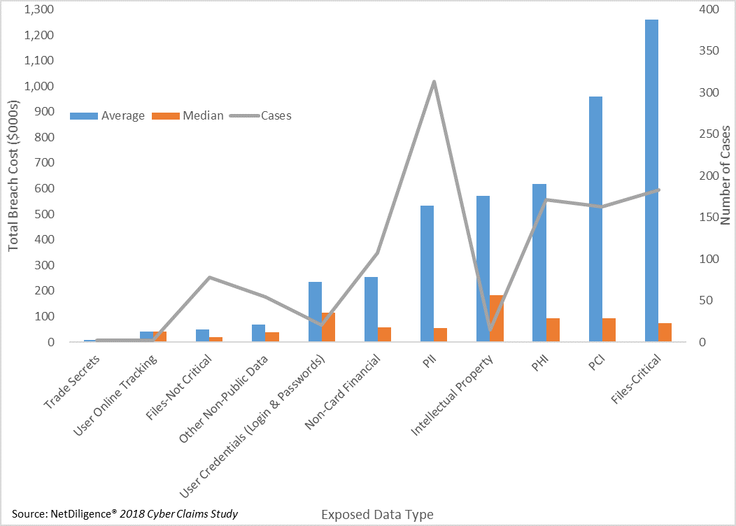
Critical Files, PCI (Payment Card Information), and PHI (Protected Health Information) each have a larger number of breaches and high average costs, albeit with significant influence from a small number of large breaches. Personally Identifiable Information (PII) is by far the most common type of data breached, and the average cost is more comparable to PHI than PCI or Critical Files. Categories like Intellectual Property have very few breaches underlying their results, so we should place little emphasis on them. In other words, when the results are based on only a handful of claims, the next handful might look completely different. Now, let's slice the data by sector.
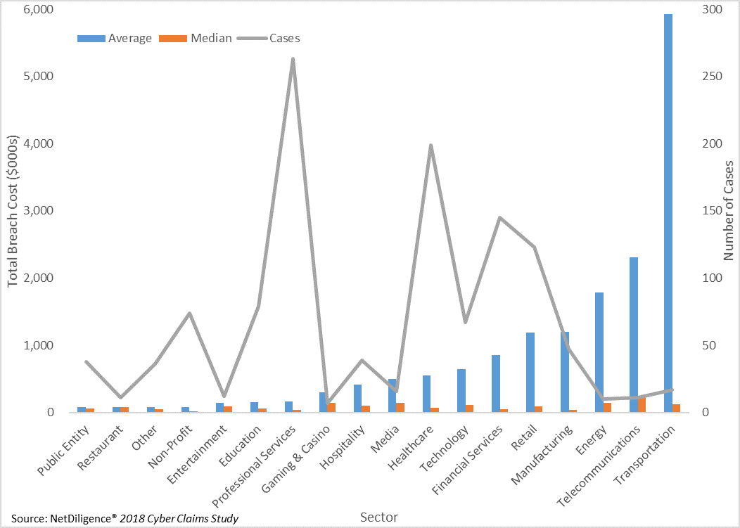
The highest (and most skewed) average breach costs by far come from the transportation sector, but there are only 17 breaches supporting this result. Retail, financial services, healthcare, and professional services have more significant numbers of breaches. Of these, only professional services has a lower and less skewed average breach cost. We will next consider the breached company's revenue size.
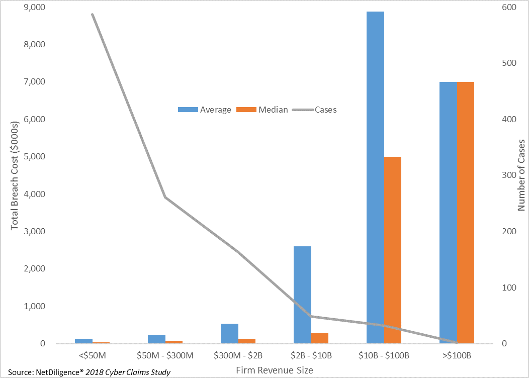
There are many more companies with less than $50 million of revenue than there are companies with billions of dollars of revenue, so it's not surprising to see fewer breaches for larger companies. Similarly, it's not surprising to see costlier breaches for larger companies, as they tend to possess greater sets of records and spend more to repair a breach and fortify against future breaches. But what if we tweak this graph to show breach costs as a percentage of annual revenue? It's important to note the orange bar will no longer be the median breach cost, but the maximum breach cost from the NetDiligence data set.
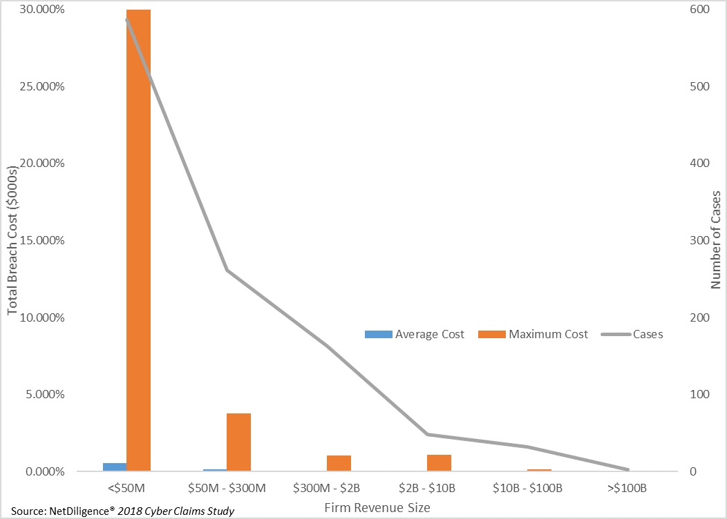
This graph illustrates the significance of breach costs for companies of various revenue sizes. For all company sizes, the average breach cost is small in comparison to their total annual revenue. What stands out most is the impact of the largest breach cost in the NetDiligence data set for companies with less than $50 million in annual revenue: 30 percent of annual revenue. This emphasizes that, while a data breach is a significant issue for any company, its cost could be catastrophic for a smaller company that could be less familiar with the various avenues to insure or otherwise transfer cyber-risk exposures.
It can be daunting to compare various commercial insurers' offerings in the new and quickly evolving cyber-risk market. When it comes to coverage limitations and sublimits in particular, it can be difficult to answer in advance the question of how the policy will respond in the event of a claim. This may point to an opportunity for the captive insurance market to step in, along with an actuary who can resolve the cyber-risk data dilemma.
Aaron N. Hillebrandt | January 14, 2019


